※ 切版分析:
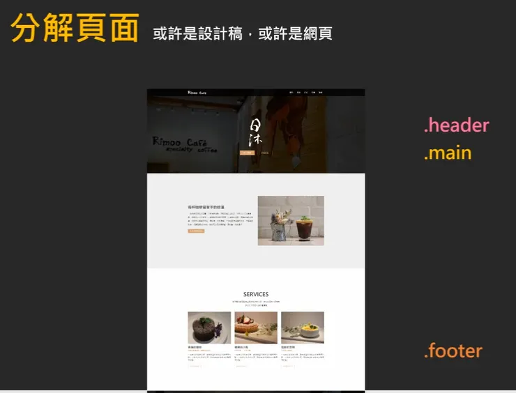
各區塊細節解析:
1. .header 頁首區
- 視覺焦點:Logo + 背景圖,營造品牌形象。
- 文字內容:包含「Rmoo Cafe」與中文標語。
- 設計重點:
- 背景圖可能使用
background-image搭配cover或contain。 - Logo 可用
<img>或 CSS 背景圖呈現。 - 文字可能使用
position: absolute疊在圖片上。
2. .main 主內容區
- 內容組成:
- 標題與段落文字介紹咖啡廳特色。
- 圖片展示環境或產品。
- 排版方式:
- 可能使用
Flexbox或Grid來排列文字與圖片。 - 圖文混排時,注意
box-sizing與margin/padding的調整。
- 響應式設計:
- 圖片可能設為
max-width: 100%以適應不同螢幕。 - 文字區塊可能有
media query控制字體大小或排列方式。
3. .footer 頁尾區
- 常見內容:
- 聯絡方式、社群連結、版權資訊。
- 設計建議:
- 使用較小字體、低彩度背景色。
- 可用
display: flex水平排列項目。
※ 範例實作:
建立firstpage_layout專案:
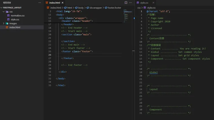
index.html:
<!DOCTYPE html>
<html lang="zh-TW">

<head>
	<meta charset="UTF-8">
	<title>日沐咖啡 Rimoo cafe</title>
	<link rel="stylesheet" href="css/normalize.css">
	<link rel="stylesheet" href="css/style.css">
</head>

<body>
	<!-- 主結構 -->
	<div class="wrapper">
		<!-- Start header -->
		<header class="header">

		</header>
		<!-- End header -->
		<!-- Start main -->
		<section class="main">

		</section>
		<!-- End main -->
		<!-- Start footer -->
		<footer class="footer">

		</footer>

		<!-- End footer -->

	</div>

</body>

</html>
style.css:
@charset "utf-8";

/*註解:

 * Page name

 * Copyright 2020

 * Author

 * Licensed

 */

/* -------------------------- *\

  Content目錄

\* -------------------------- */

/**目錄撰寫

 * Content ............ You are reading it!

 * Global ............ Set common styles

 * Layout ............ Set grid styles

 * Component ............ Set component styles

 */


/* -------------------------- *\

  Global

\* -------------------------- */


/* -------------------------- *\

  Layout

\* -------------------------- */


/* -------------------------- *\

  Component

\* -------------------------- */
成果顯示:
全域選擇器設定 :style.css
* {
	/* 控制元素的尺寸計算方式 */
	box-sizing: border-box;
	/* 成為絕對定位元素的「錨點」 */
	position: relative;

}
設定網頁文字 :
style.css
html,
body {
	font-family: '微軟正黑體', arial;
}

/* 初始設定 */
h1,
h2,
h3,
h4,
h5,
h6,
p {
	margin: 0;
}

ul {
	margin: 0;
	padding: 0;
	list-style: none;
}

a {
	text-decoration: none;
	color: #333;
}
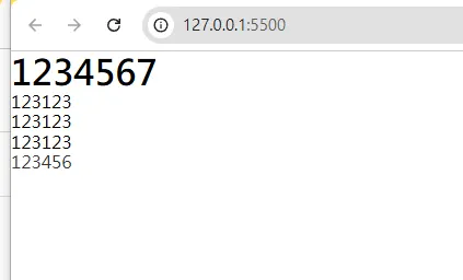
index.html:
<body>成果顯示:
<!-- 主結構 -->
<div class="wrapper">
<!-- Start header -->
<header class="header">
<h1>1234567</h1>
<ul>
<li>123123</li>
<li>123123</li>
<li>123123</li>
</ul>
<a href="">123456</a>
</header>
<!-- End header -->
</div>
</body>
※ layout實作:
置中版型:
index.html:
<body>
	<!-- 主結構 -->
	<div class="wrapper">
			<!-- Start main -->
		<section class="main">
			<div class="container">
				12345678
			</div>
		</section>
		<!-- End main -->

			</div>

</body>
style.css:
/* 置中版型設定 */
.container {
	width: 1200px;
	margin: 0 auto;
	padding-left: 16px;
	padding-right: 16px;
	border: 1px solid #333;
}
成果顯示:
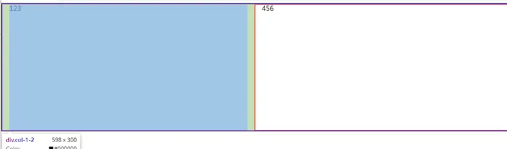
多欄式版型:
index.html:
<body>
	<!-- 主結構 -->
	<div class="wrapper">
			<!-- Start main -->
		<section class="main">
					<div class="container">
				<div class="row">
					<div class="col-1-2">123</div>
					<div class="col-1-2">456</div>
				</div>
			</div>
		</section>
		<!-- End main -->

					</div>

</body>
style.css:
/* 多欄式版型 */
.row {
	border: 1px solid blue;
	margin-left: -16px;
	margin-right: -16px;
}

/* 浮動清除動作 */
.row:after {
	content: '';
	/* 讓元素變成一整行 */
	display: block;
	/*清除浮動現象  */
	clear: both;
}

/* float排版 */
.col-1-2,
.col-1-3,
.col-1-4 {
	/* 向左浮動 */
	border: 1px solid red;
	float: left;
	height: 300px;
	/* 由col去推一個向左和向右的間距 */
	padding-left: 16px;
	padding-right: 16px;
}

/* 兩欄式 */
.col-1-2 {
	width: 50%;
}

/* 三欄式 */
.col-1-3 {
	width: 33.333333%;
}

/* 四欄式 */
.col-1-4 {
	width: 25%;
}
成果顯示:
※ 元件實作:
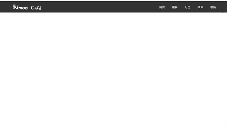
navbar:
index.html:
<body>
	<!-- 主結構 -->
	<div class="wrapper">
			<!-- Start header -->
					<header class="header">
			<!-- 導覽列 -->
			<div class="navbar">
				<!-- 置中版面 -->
				<div class="container">
					<!-- 左邊logo -->
					<a href="#!" class="brand">
						<!-- 搜尋引擎優化 -->
						<h1>日沐咖啡 Rimoo cafe</h1>
					</a>
					<!-- 導覽按鈕 -->
										<ul class="nav">
						<li class="nav-item">
							<a href="#about" class="nav-link">關於</a>
						</li>
						<li class="nav-item">
							<a href="#service" class="nav-link">服務</a>
						</li>
						<li class="nav-item">
							<a href="#reservation" class="nav-link">訂位</a>
						</li>
						<li class="nav-item">
							<a href="#menu" class="nav-link">菜單</a>
						</li>
						<li class="nav-item">
							<a href="#contact" class="nav-link">聯絡</a>
						</li>
					</ul>
				</div>
			</div>
		</header>
		<!-- End header -->
							</div>

</body>
style.css:
/* -------------------------- *\
	Component元件
\* -------------------------- */
/* navbar */
.navbar {
	border: 1px solid #000;
	height: 64px;
	/* 背景顏色 */
	background-color: rgba(0, 0, 0, 0.8);
	position: fixed;
	/* 提升層級 */
	z-index: 500;
	width: 100%;
	left: 0;
	top: 0;
}

/* 商標 */
.navbar .brand {
	display: inline-block;
	/* 強制向上對齊 */
	vertical-align: top;
	/* border: 1px solid #000; */
	width: 160px;
	height: 64px;
	background-image: url('../images/common/logo.jpg');
	/* 完整顯示logo */
	background-size: contain;
	/* 取消重複 */
	background-repeat: no-repeat;
	/* 置中設定 */
	background-position: center;
	/* 關鍵字設定 */
	/* color: #fff; */
	/* 不換行 */
	white-space: nowrap;
	/* 縮格;參照值來自元件的寬度 */
	text-indent: 100%;
	/* 隱藏超出的部分 */
	overflow: hidden;
}

/* 選單部分 */
.navbar .nav {
	/* 讓元件移到右邊 */
	float: right;
}
.navbar .nav .nav-item {
	/* 讓文字橫向排列 */
	float: left;
}

.navbar .nav .nav-link {
	/* 按鈕設定 */
	/* 讓按鈕獨立顯示,並且可以設定寬高、背景色等樣式 */
	display: block;
	color: #fff;
	/* 高度推擠 */
	line-height: 24px;
	padding: 20px;
	/* 凸顯按鈕位置 */
	/* border: 1px solid #000; */
	/* 時間變化 */
	transition: color 0.3s;
}
/* 按鈕微互動設定 */
.navbar .nav .nav-link:hover {
	color: #d5a26f;
}
成果顯示: