Case Study Exercise from Coursera's Google UX Design Specification

The full name of the class is “Google UX Design Professional Certificate”, where students have to finish all 7 modules, each comes with 3~7 weekly courses. There are 3 design projects throughout the whole professional certificate (also called “Specification” by Coursera). In this article I will share my first UX design project in a case study approach with notes of my thinking process.
In the first course, students have to pick a design topic from a Sharpen Design Challenge Generator. I chose to design a virtual tour app, and set National Palace Museum as my study subject.
Please note that I made a lot of assumptions for the purpose of this case study, so all the research interviews results are hypothetical. And National Palace Museum owned all the copyrights of artworks images and logo used in this design project.
Here we go:
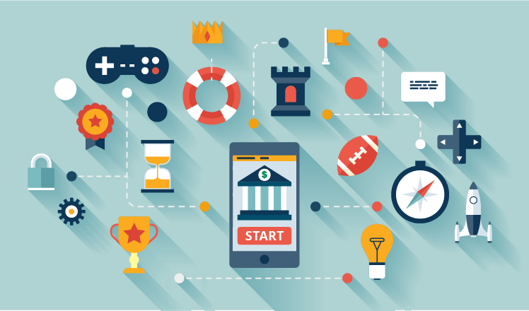
Project Overview
Let me start with a direct screenshot of the case study deck.

Understanding The User
User Research — Summary
I conducted a Fundamental Research to understand who are National Palace Museum’s target clients and what are their needs and pain points. The museum already has a website with rich contents, I will try to transfer those contents to a brand new app.
Initial research showed that while the museum released a few apps in the past, it’s not widely-used outside the premise and only Android versions were available. Due to the aftermath of COVID, most of the museums around the world are suffering financially due to the long time closure. I see some famous museums already developed powerful apps for virtual tour service. Given foreign tourists accounts for 75% of National Palace Museum’s visitor counts (source), it’s imperative that the museum can release an app for similar service soon in additional to digital contents on their website.
My design of the app will be focusing on serving customers’ needs when physical visit is not possible, and on building up long-term usage for NBU (the Next Billion Users).
User Pain Points — Persona of Sally & George
2 personas were created to reflect different target client groups as shown below.
When drafting personas and value proposition for the museum, I put myself in the shoes of its oversea and local visitors. To be honest, it all comes natural for me. As a long-time art lover, I almost always visit at least one gallery or museum of some sorts when traveling abroad. I even include my own pain points and frustration, which usually caused by some museums merely trying to transfer all their website contents into an app, without considering the diversity in their respective user base and what are the ultimate goals these apps are trying to accomplish.


User Journey Map — George’s Example
George’s user journey reveals that the museum should provide more exhibitions to choose from, enrich the contents, and consider adding closed captioning for users with hearing disability. Enhancing overall app stability and loading speed is also critical.

Storyboard
Storyboard, I think I heard the word a lot when watching some behind-the-scenes movie clips, but I never really get it, until now. My task was to tell a story about why the app can address customer’s pain points. It’s been ages since I drew something with only pencil and paper, but duty call, let’s do it!

Sitemap
A “sitemap” of the app should be drafted after all the research phrases to make sure you have a high-level view of how your app will be structured. Preparing a sitemap will help you think through the whole user flow and select key screens to start the design.
Starting the Design
Paper Wireframes
As a start, I need to craft some “paper wireframes”. I drew 5 versions of the “artwork info” screen showing how artworks were displayed after users select them from the “virtual tour” screen. “Jadeite Cabbage” was the chosen placeholder as it is one of the most famous collections of the museum.
I kept a concise design and hid long context of the artwork description in the telescope icon. The 3-dots carousel function can display other information like artists’ anecdote. Also, at the bottom of the screen users can choose 3 related artworks.

Yeah, I know, above is an elementary-level drawing… The stars were used to mark the elements of each sketch that would be used in the later digital wireframes.
Digital Wireframes
Next step is where UX design tool comes in, here I use Figma to draw my first digital wireframes. A really good tool for beginners to draft simple layout, a lot of functions to play with if have more time to explore.

Low-fidelity Prototype
The “low-fidelity prototype” (“lo-fi” for short) connected the virtual tour user flow from welcome message, map navigation, to artwork selection and appreciation. It also embeds interesting features like saving your favorite artworks in a gallery. I will set this feature to be accessible for museum members only. The lo-fi fidelity prototype at this stage will be used in later usability test.

Usability Study with Findings
This step is to conduct 2 rounds of usability studies. Findings from the 1st study helped guide the design from wireframes to “mockups”. For the 2nd round, I used a high-fidelity prototype to iterate changes based on new feedbacks before I started the final design. Multiple findings are discovered so need to prioritize and decide which ones should be fine-tune first.

Refine the Design
Now let me add some colors, the screen looks much real with actual images.
Mockups


Time for connecting the screens. I felt like doing kids’ “number connecting game”, and it’s always satisfying to see the final output revealed itself. Feel free to play with my design for the virtual tour user flow here.

Of course, a good UX designer can’t ignore “accessibility”, so I’ll make sure that each image will have alternative text, all audio files will come with transcripts, and any video will be embedded with closed captioning, etc. There’re a lot more to consider when design with a diversity and inclusion mindset.
Responsive Design
Although I’m designing for an app, I also need to consider “responsive design” when users browsing contents on different devices. Below is a mockups design for 3 devices (iPhone X, iPad mini, and Macbook Pro) to showcase screen size variations.

Takeaway and Personal Notes
When I conducting competitor research, I learned a lot from other museums’ app like Rijksmuseum in Amsterdam, British Museum in London, and American Museum of Natural History in New York. Without saying, they are the best in the industry (source). I haven’t found any other museum or art gallery app that can come close. I wonder how long did it take for them to develop such interactive and powerful platforms.
Meanwhile, it’s challenging to embed accessibility functions in an app, for the project I am working on and for all elites alike. Guess in the end, everything comes to how much effort a museum is willing to commit and how professional and artistic the designer team is.
This is my first UX project, hope you enjoy it. Thank you for your time, and feel free to reach out!
If you like my article, feel free to give me a clap below or follow my account. If you are a fellow museum fan and is doing some self-learning on UX design too, don’t be shy to leave your comments! Find more case studies and business stories here.
What’s more, you can always give me some “Likes” if you are a Liker on Liker Land.
Liker Land is a place where you can register for free to be a “Liker” and support content creators. Without the intervention of mass corporate ads, this blockchain application is a great invention to support individual creators. If you’re already onboard, welcome to show your support via the link below.