Have you ever listened to Podcasts on Spotify or read subtitles when watching foreign language films?
You might not be familiar with the concept of Inclusive Design, however, the examples above are common applications of Inclusive Design in our everyday lives!
In this article, we'll dive deeper into understanding the definition of Inclusive Design, its benefits, and the principles of Inclusive Design as outlined by Microsoft.
Note: While Inclusive Design can be applied to optimize most products in life, the examples that Lollypop will provide in this article will focus on its applications in digital products such as Websites and Apps.
What is Inclusive Design?
Inclusive Design is an human-centered design approach that aims to create products, services, and experiences catering to the needs of a wide range of user groups, beyond the ideal personas. Typically, inclusiveness in Website/App design is often manifested by considering all user groups, regardless of their gender, geographic location, language, culture, or physical abilities.
To demonstrate the benefits of Inclusive Design, the Centre for Inclusive Design collaborated with Adobe and Microsoft to conduct a study in Australia on the topic: "The Benefits of Designing for Everyone Report".
The results showed that up to 5 million Australians were unable to access certain products/services. This group includes people with disabilities, the elderly, or those excluded due to their geographic location, gender, or financial status. However, they have a total disposable income of more than $40 billion per year, which could provide a significant revenue source for businesses (if the products/services are better optimized for inclusivity).
According to the same study, when Education, Finance, or Retail products/services in Australia are optimized for Inclusive Design, they can:
- Bring an additional 228,000 university degrees, contributing to increased employment and wages up to $4.5 billion per year.
- Support more than 830,000 Australians to improve their financial capabilities.
- Help retailers increase their revenue by up to $4 billion.
You may want to read about: Understanding the role of culture in website and app localization
Inclusive Design vs Accessibility Design
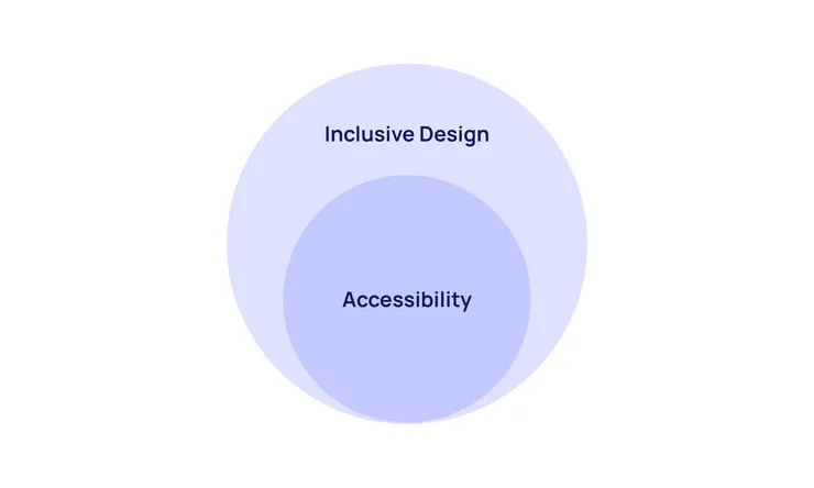
The terms "Accessibility Design" and "Inclusive Design" are often used interchangeably, but in reality, Accessibility is just one of the elements that make up Inclusive Design.
Accessibility Design is an approach that design for disabled people, aiming to minimize barriers so that features and content can be easily accessed and used by people with hearing, mobility, vision, speech, or cognitive impairments.
Inclusive Design, on the other hand, has a much broader scope! In addition to creating accessible products for people with disabilities, Inclusive Design also considers factors such as age, culture, economic status, education, gender, weight, geographic location, language, and ethnicity to ensure that the design can meet the needs of everyone.
A product is designed with accessibility in mind can still cause some problems such as:
- Gender discrimination: Providing only Male/Female options in a registration form, without including options for LGBTQ+ individuals.
- Skin color bias: Using only images of white people to represent beautiful or successful people, excluding diverse representations.
- Body Shaming: Designing a fingerprint sensor based on the "average" fingerprint pattern, making it difficult for people who are overweight or have larger hands to use the device.
3 Key Principles of Inclusive Design
Microsoft consistently places a strong emphasis on the importance of Inclusive Design in its product development. According to the company, the reason why design solutions often lack comprehensiveness is that designers are typically influenced by their own inherent biases.
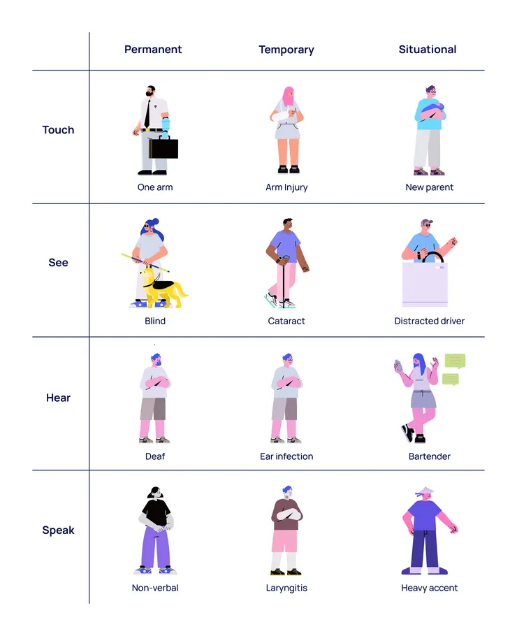
In 2016, Microsoft published a document called the "Inclusive 101 GuideBook” that outlines 3 key principles of Inclusive Design to raise awareness and promote inclusiveness in product design.
1. Recognize Exclusion
The first principle of Microsoft Inclusive Design states that to create a truly inclusive design, designers must first acknowledge their own biases and recognize the groups of people who are excluded as a result of those biases.
Most products on the market today are designed primarily with the "ideal" user and usage scenario in mind. This approach inadvertently excludes not just people with permanent disabilities like visual, hearing, or speech impairments, but also users who are using the product in different or challenging circumstances, such as: Driving a car, Having one arm in a cast, Watching a video in a noisy environment,...
2. Learn from Diversity
While recognizing exclusion is an excellent starting point for enhancing design inclusivity, it's crucial to dive deeper.
During product development, UX designers can engage in simulations like "Blindfolded" or "Earmuffed" experiences to gain a deeper understanding of the challenges faced by individuals with disabilities when interacting with the world around them.
However, it's important to recognize that simulations only provide a limited perspective on the user experience. In reality, numerous factors influence how people interact with the world and use products, including individual abilities, experiences, emotions, and cultural backgrounds.
The second principle, therefore, emphasizes the need for UX designers to delve into user diversity through observation and interviews. By truly understanding the diverse user needs and pain points, designers can create designs that align with them, rather than relying solely on assumptions or simulated experiences.
3. Solve for One, Extend to Many
True to its name, the third principle advocates for focusing on solving the usability challenges of a specific user group, often those with disabilities or other significant barriers, as the path to enhancing the experience for a much broader range of users. In our everyday lives, we encounter countless examples that illustrate the power of this approach:
- Closed Captions: Initially developed to cater to the needs of individuals with hearing impairments, closed captions have become an invaluable feature for users in all sorts of noisy environments, from airports to hospitals.
- High-Contrast Displays: Designed primarily to assist the visually impaired community, high-contrast displays have also proved tremendously beneficial for people using devices in direct sunlight.
This principle also applies to a wide variety of features and devices, including remote controls, automatic doors, audiobooks, and more. By focusing on solving the specific usability challenges faced by "extreme" users, designers can often unlock solutions that end up greatly improving the experience for the masses.
Figure out more: 7 UI UX Design Principles for Mobile App Development
3 Essential Elements of Inclusive Design
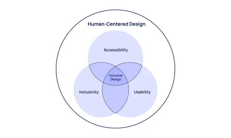
Inclusive Design is a holistic approach that encompasses three essential elements: Accessibility, Usability, and Inclusivity. According to the Interaction Design Foundation, these three pillars work together to create products and experiences that cater to the diverse needs of all users. Let's dive into each of these elements:
1. Accessibility
In order to design for Accessibility, you can apply the design standards in WCAG!
WCAG (Web Content Accessibility Guidelines) is an international set of standards for web content accessibility, developed and maintained by the W3C - the organization that develops and manages standards for the World Wide Web.
To ensure that websites and apps can be accessed and used by everyone in everywhere, WCAG provides four main Accessibility principles:
- Perceivable: Information must be presented in a way that users can perceive with one or more of their senses.
- Operable: Users must be able to control all interface elements using various methods, such as a keyboard, mouse, touchscreen, or voice.
- Understandable: The information and language on the website must be easy to comprehend for everyone.
- Robust: Web content must be compatible with a wide range of assistive technologies and web browsers.
In addition, the WCAG Standard also includes a list of 13 Guidelines and corresponding Success Criteria, which help designers easily evaluate their effectiveness during implementation.
Learn more about: How to optimize Mobile-first Responsive Design
2. Usability
Next, to check the Usability of your product, the most common method is Usability Testing!
In this process, UX researchers engage participants to perform specific tasks on the product, closely observing their actions and behaviors. Participants are then asked questions to better understand their motivations and thought processes during the tasks.
The recorded feedback and observations are carefully analyzed to identify potential usability issues and pinpoint opportunities for design improvements.
It should be noted that there are many different approaches to Usability Testing, including:
- Location: Remote testing or In-person testing.
- Format: Moderated or Unmoderated.
- Objective: Compare multiple versions (Comparative) or Explore potential issues (Explorative).
Carefully considering these factors will help you choose the Usability Testing approach that best suits your specific needs and goals.
3. Inclusivity
To improve the Inclusivity of your product, you can refer to the Inclusive Language Standards developed by the Atlassian Design System. These guidelines cover:
- How to describe people in a neutral, objective, and respectful manner
- Techniques for avoiding exclusionary language
- Strategies for creating inclusive product experiences
Adhering to these Standards helps ensure that your product's language and imagery are free from bias, stereotypes, or discrimination against any group of users. This allows you to create experiences that are welcoming and accessible to people of all backgrounds and abilities.
Talking about language, you may not want to miss: How we localize UX content in Asia Pacific Region
Final thought
This overview from Lollypop has provided a comprehensive understanding of Inclusive Design. It's important to remember that creating a truly inclusive design for every single user in the world is an immensely challenging, if not impossible, goal.
The key is to identify your target audience, set realistic Inclusive UX goals, and establish milestones for each stage of the design process. This strategic approach will be the most effective way to create an inclusive product that caters to the diverse needs of your users.
Keep in mind: Designing for inclusivity is an ongoing journey, not a one-time effort. It requires continuous testing, evaluation, and product refinement to ensure that the design remains accessible, usable, and inclusive over time.
By embracing this iterative mindset and focusing on the specific needs of your target audience, you can make meaningful progress toward crafting products and experiences that empower and engage a wide range of users.
Frequently Asked Questions (FAQ)
1. What is the Importance of Inclusive Design in UX Design?
Inclusive Design is crucial in ensuring that products and services can be effectively used by everyone, regardless of their gender, location, language, culture, or physical abilities. By prioritizing inclusivity, we can create a more equitable and respectful digital landscape that empowers all users to engage and participate fully.
2. How to Create an Inclusive UX Design?
To create inclusive design products, we need to follow a clear and structured process. First of all, we need to identify the following factors:
- Who are we designing for, and what is the usage scenario?
- What is important to these groups?
- What are Internal resources and limitations (manpower, time, cost)? With these insights, you can then follow a standard design process from Research, Design, Prototyping, Testing, and finally Development. Czech out the Agile Design Process that Lollypop applies as an example!
3. What are Inclusive Design examples in Practice
Some examples of Inclusive Design in practice include features such as Speech-to-Text or Audiobooks to support people with visual impairments, High-contrast colors for people with color blindness, Customizable language/font size features to support users in different geographical areas as well as those with vision problems,...
4. What are the differences between Inclusive Design vs Universal Design?
Inclusive Design aims to create "one-size-fits-one" solutions - personalized for each individual with differences in ability, culture, gender, age, understanding,... Universal Design aims to design "one-size-fits-all" solutions - i.e. creating products and services that everyone can use without the need for special adjustment or adaptation.
5. What are the differences between Accessibility and Inclusive Design?
The main difference between Inclusive Design and Accessibility Design lies in the scope and design goals. While inclusive design solutions aim to create flexibility and personalization for each individual with differences in ability, culture, gender, age, and understanding,... Accessibility Design aims to “Design for Disability” which focuses on ensuring that products and services can be used by people with disabilities, meeting accessibility standards and regulations, such as the Web Content Accessibility Guidelines (WCAG) principles.


