
I find the color way too light, we need to adjust it.
Ok, no problem.
So we find the components fit the design and adjust it manually over and over again. Just before testing, we find there’s something to revamp. Oh..!
The scenario happens often when designers hand layouts over to the developers. Developers may encounter the same issues, tweaking the components and making them right in the positions repeatedly. This time-consuming way on making the design right is inefficient for both designers and developers. And might cause inconsistencies on designs.
Ok, so how do we make it better? Today we are going to introduce the concept of Design tokens, sharing the efficient way on making design and developing process more smoothly.
What is design tokens?
Design tokens is a code and common language in between designers and developers, it is a language for editing values like colours, fonts, and spacing. Creating a united code token, allowing components and design system managed in a rapid, efficient, and effective way in UI design.

For example, a color could be used in various products to reach its consistency. So when we change the color, we have to tweak the color one after another. It’s not an efficient way.
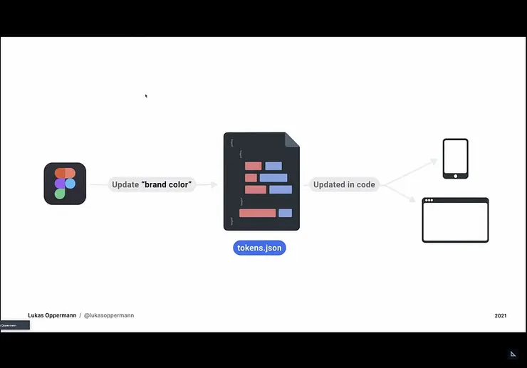
But once you apply the design tokens, what we need to do is to reference to the token content. Take Figma as example, upon establishing and creating design tokens, we can export JSON and edit them in design system, having them changed in consistency on diverse products and devices rapidly.
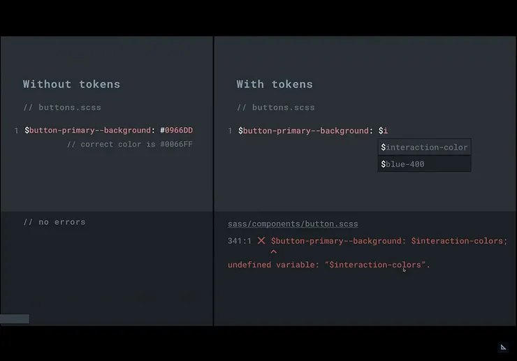
Design tokens may help developers go on a smooth way during the developing/ engineering process; that is to say, having design tokens take the raw values. It not only reduces mistakes while applying the color values but allowing people to apply IDE (integrated development environment) when creating design tokens, eliminating bugs and speeding up the design process.
How to create design tokens?
Currently there’s no single source of truth we can follow. Nonetheless, W3C Design Token Community Group shared an initial naming frameworks and recommendations in 2022 Figma schema. Aside from above mentioned resources, there’s design guideline on design tokens from Material Design 3 created by Google.
Design tokens framework
If we want to create a more comprehensive design tokens, we should apply the naming, values and its categories.
Of course you can add some descriptions on design tokens for collaborating with your colleagues for better understanding.
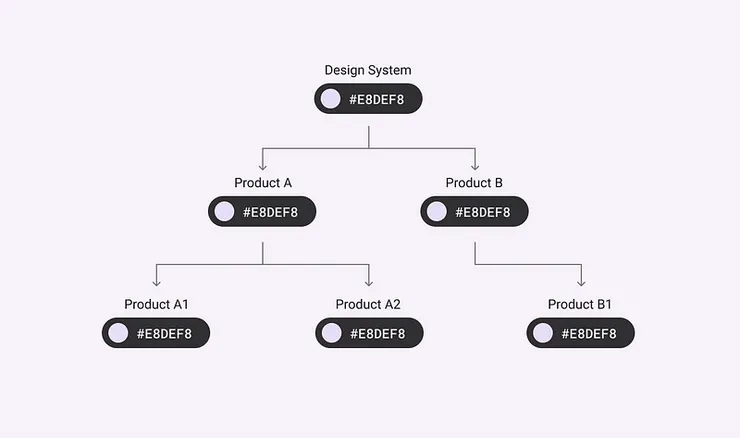
It could be applied on various objects/layers on the same name. We can then place them into categories, segment them into brands, types, and the way how we want to apply the layers.
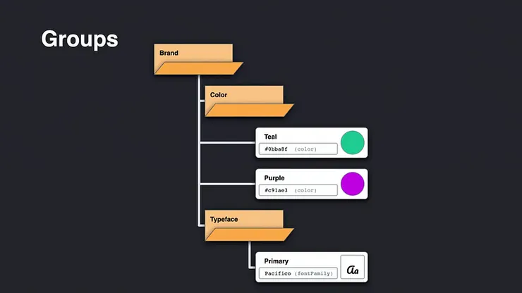
Layers on the design tokens are subject to change/routes based on their categories. The framework is to create the unique name retrospectively.
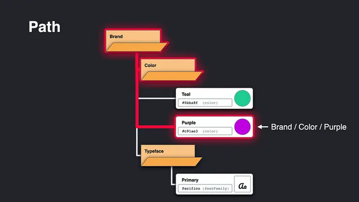
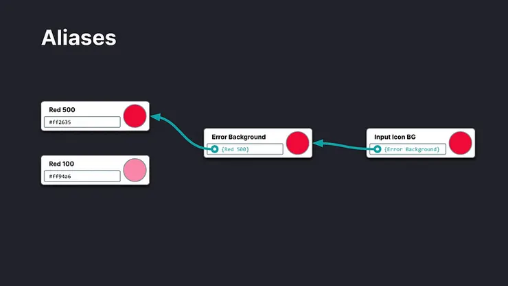
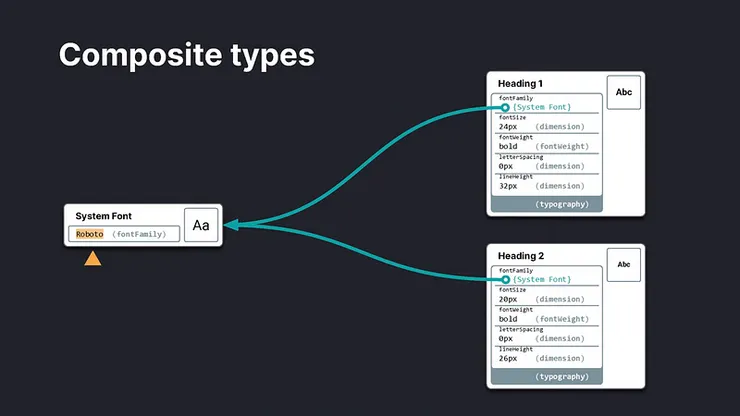
There is a essential concept in design tokens, that is “Aliases”. The same value could be utilize on various components. By applying Aliases, we can adjust content for its corresponding component. You can find the image below, what you need to do is to change the direction.
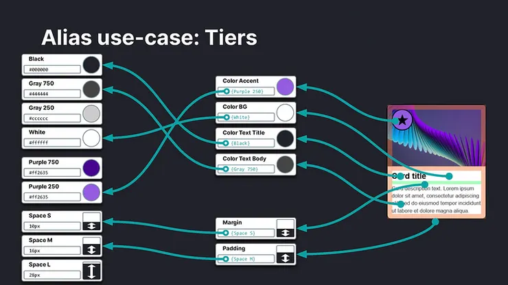
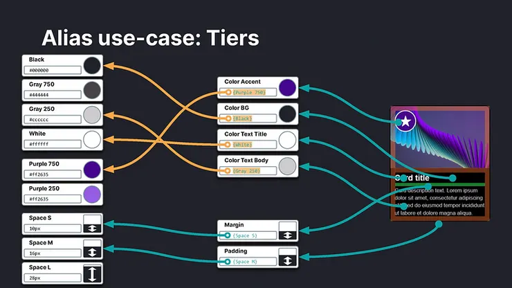
The framework is way good on various modules. For example, we need to change the reference token in the components when designing dark mode, which not only makes the whole process much more smoothly, but more efficient on managing the design system.
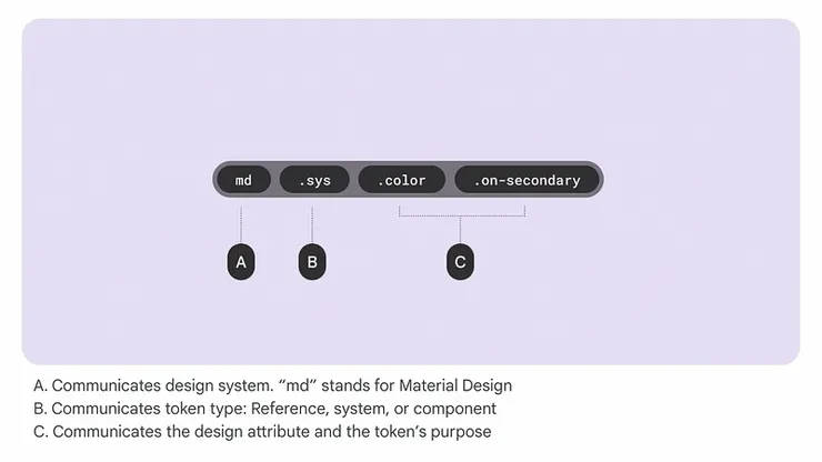
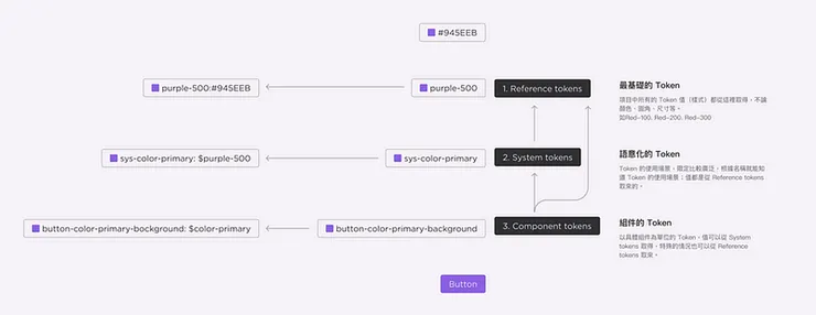
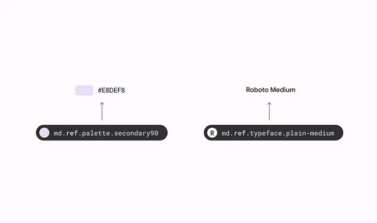
In Material Design guided by Google, design tokens is segmented into reference, system, and component for managing hierarchy and usages on further extension.
We can place various design tokens into row of set, the same value could be utilize in various components. For example, title 1 and 2 apply the same font, so when we want to change the font, what we need to do is to change the content of the token.
Steps on naming Design tokens (Material Design as instance)
Step 1. Change value into the basic token — reference token
Reference token holds all the applicable options in design system, you might see global token in some cases. Having values changed into reference tokens helps us better manage types and values in the design system we utilize.
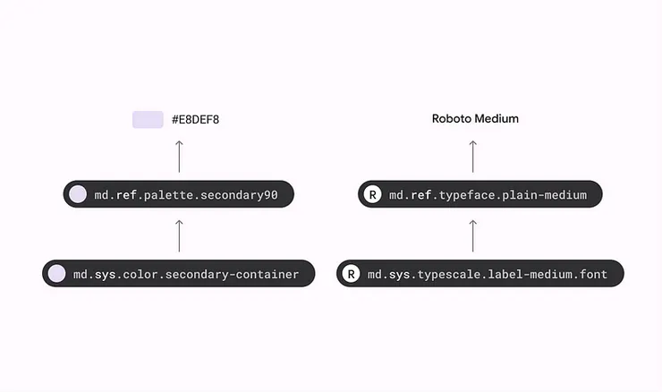
Step 2. Define the attribute on token — system token
System token is semantic token, which defines the actual attributes in design tokens. By naming in semantic way, we know the scenarios in design tokens. So while naming, it is better to avoid using words and values as the codes we might use. For example, technical wise, “type” contains different definitions, so it’s better to avoid using it while naming.
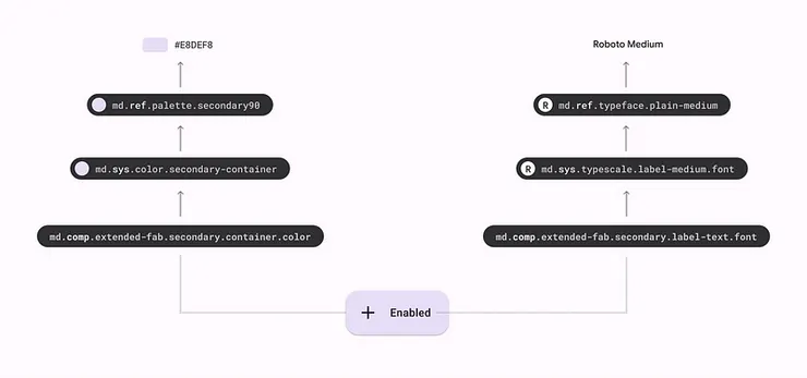
Step 3. deploy tokens to the components — component token
Wrap and limit the utilization on design tokens based on components. A system token could be used on several components. So what to do if we want to change one of the components? We can split the semantic tokens into segments and change them based on the needs.
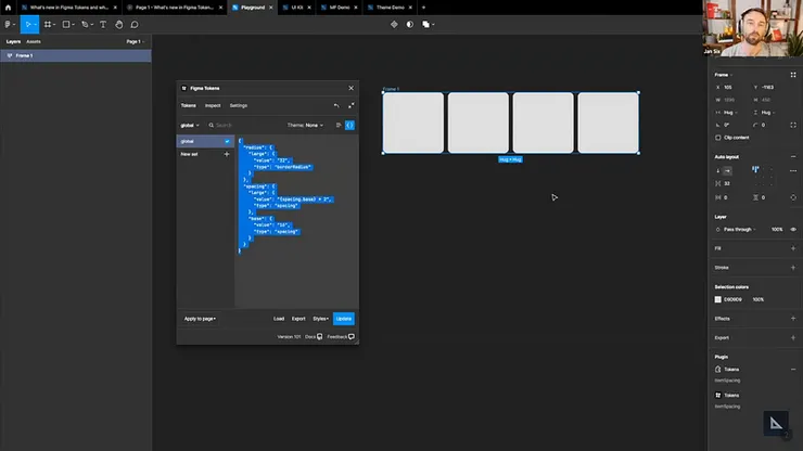
Figma plugin tool — Figma tokens
“Figma tokens” plugin allows designers to manage colors, styles as well as attributes. We can not only use it for managing colors, styles, and attributes but as references to create frameworks, which ranges from reference, ratio to value.
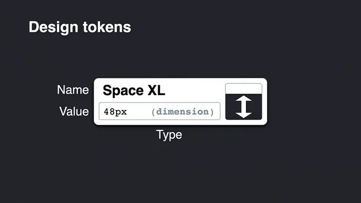
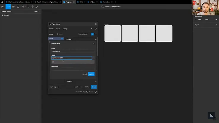
Here we take spacing for example. We can define values in spacing in design tokens, and utilizing it in auto-layout.
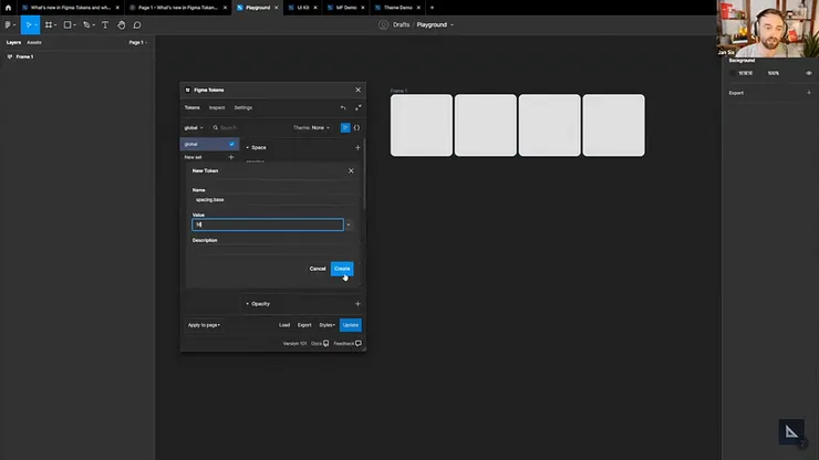
We can also use reference design tokens, the value is in align with the math equation, you can see and create spacing {spacing.base}*2.
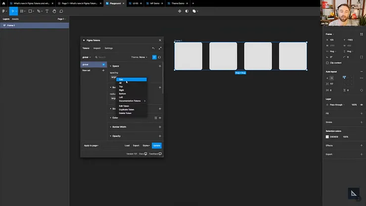
Once establishing design tokens, we can apply them to design layouts.
We can preview JSON with the plugin Figmatoken.
Plugin — Figma tokens allows us to export JSON for further usage in various Figma files. There’s various files being used in different platforms, the feature helps on maintaining the consistency. It is just way easy to manage the design system. (Advices from our colleague Mila ^-^)
Conclusion
It might take some effort to architect design tokens. But once created, it helps on managing design system in a more efficient way. Aside from changing the files and formats among which, it is a rapid way to update the whole project for developers, upgrade and enhance the process on developing. It also functions as bridge in between designers and developers, making system and process run in a smooth way.
We think we need not merely to realize the asthetics in design but also create the design system on its modulation, make them systematic on components in design system on Day1 as making ourselves — UI Designers competitive in the blue market. Hence, we encourage designers to create and immerse themselves in the process of creating design tokens; meanwhile, enjoy the fruitful results by single truth of clicks and changes.
Note
References we took for the article
Note: the article is written by Able intern Cheryl Fang, edited by Steven Yeh, and interpreted/ translated by Ching Hsu.