
Charts is a common way to address information, it can articulately convey complicated information which cannot be illustrated by words, helping users to understand the usage and showcase its features. Charts could be applied in many aspects, like the Health App from Apple, which indicates our condition. The weather App helps us scheduling by using the charts.
Charts are basically apparent, so when we do the chart design, if the purpose is not taken into consideration, but only for its appealing style, people might get confused. So how do we design effective and good-looking charts?
We would like to share and introduce on the lectures of Apple WWDC 2022 and Google Material Design, how they design appealing and effective charts in UI design in detail.
One: Design app experiences with charts
For conveying information by utilizing better charts, we have to build a good experience prior to designing the charts. Articulating the purpose, time, and by using charts and the relationship between charts. Without further do, let’s talk about how to build good user experience by using charts.
- WHEN to use charts
- HOW to use charts
- Charts design SYSTEMS
When to use charts
Chart provide focused
In the application, lots of things could be visualized, but only the most important thing could be made into charts. Charts could attract users’s attention and help them realize the necessary information. That is to say, a focus is offered when the chart is properly used.
Here are some common usages.
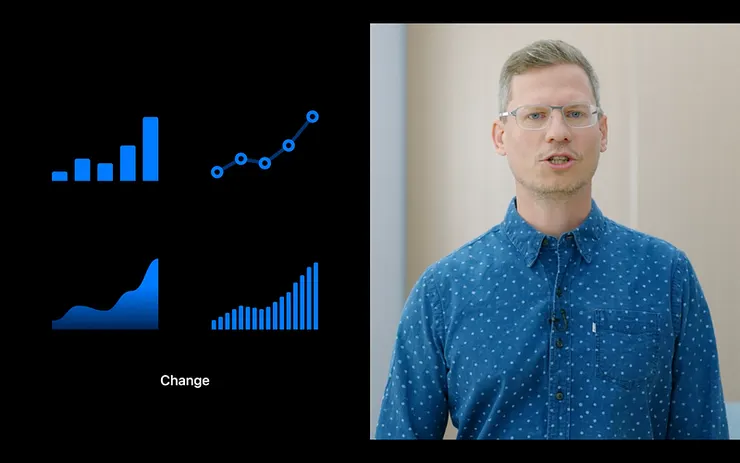
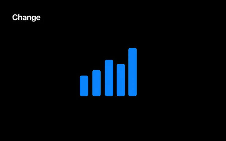
Change
Charts could indicate the changes of information, like history record and the forecast/ prognoses of the future trends.
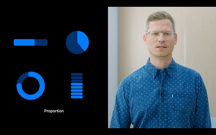
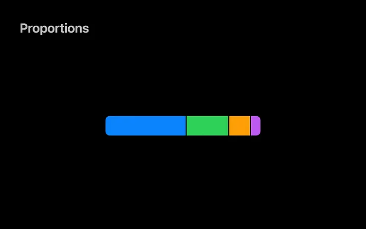
Proportion
When the chart is illustrated as ratio, it showcases the status of the information. For example, showing the status of „finished“, “in progress“, and „blank“.
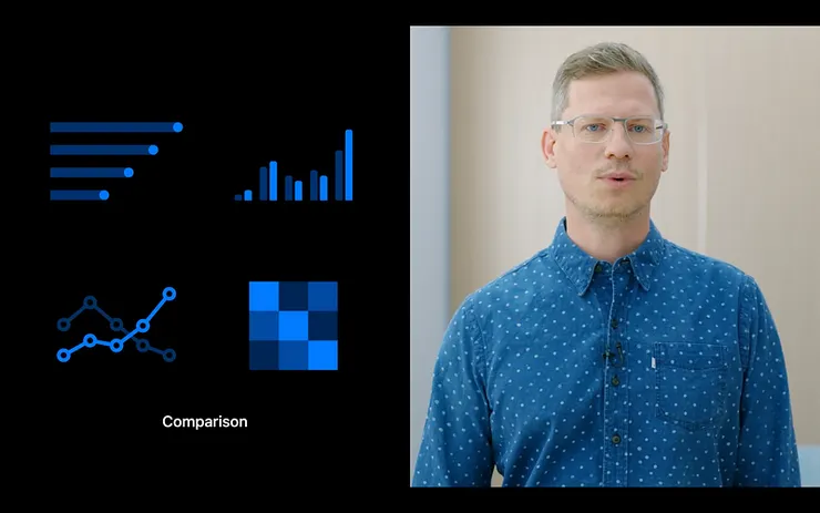
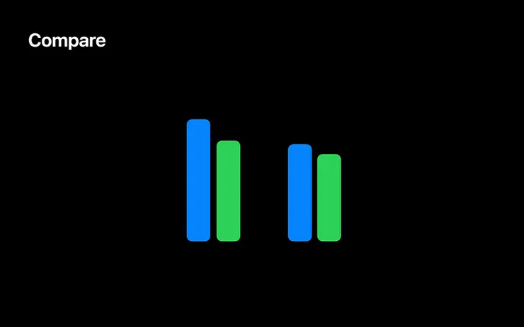
Comparison
When it comes to comparison, charts helps doing better evaluation.It has close relationship with the purpose we aim for when it comes to making choices and when we will use it.
A proper chart showcases a focus for users to identify at the first sight.
How to use charts
How do we use chart with the chosen dataset?
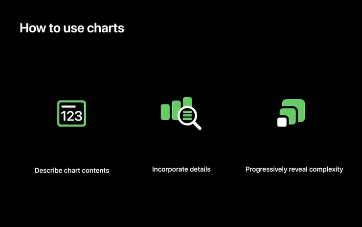
Describe chart contents
We need to describe the content and the focus points if we want to make users realize the charts rapidly. Description could be used for summarizing. For example, the description like „the revenue has raised 12%“, “1423 pieces was sold“.
Incorporate details
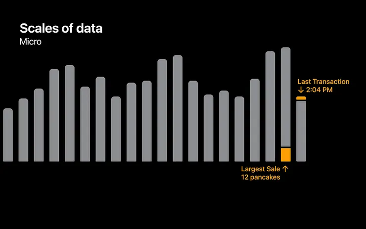
Aside from consolidating the information for charts, we can integrate the data with various aspects. On micro level, we can see the largest sale and the last transaction.
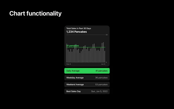
We can also see the corresponding information. By clicking the chart below we see daily average sales. Because normally there’s a certain amount of information, how they showcase the chart functionality is more suitable for larger chart.
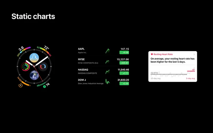
As for the smaller chart, it is better to apply the static chart. Like the integration for watch, stock chart, and health status chart. Static charts is normally showcased as thumbnail, so it will show up with other charts. Users can see precise information by clicking the charts.
Progressively reveal complexity
When showcasing the charts, we should know the hierarchy of chart gradually. Showing contents which evoke users’ interest. When a user is interested in a chart, they want to see more information about the chart. So please keep the information and its attribute in the beginning, avoid any confusions it may cause.

Charts design system
When designing multiple charts, in the meanwhile, you create a chart design system. For a better understanding to identify the information charts, here are some points to we can apply:
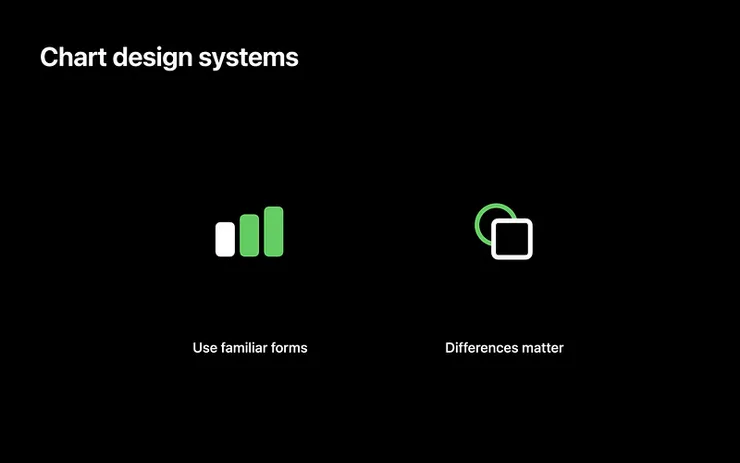
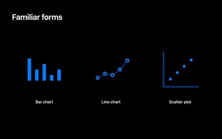
Use familiar form
We can help users to identify the usage by applying familiar forms. For example, bar chart and line chart are common charts people apply. However, scatter plot is not so common as though, probably because it needs further indication/ direction to ensure it is properly used.
Difference matter
Divergence made purposely in between the charts could make people better identify the differences.
Two: Design an effective charts
We can build the charts once we know how we are going to use the chart. Users get effective information and can identify the point in chart easily. So how should we do?
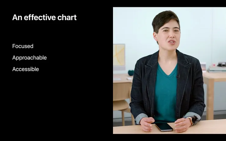
An effective chart must be:
- Focused
- Approachable
- Accessible
Charts must be able to showcase the points, making users easy to identify and approach; meanwhile, allow access to everyone.
Design chart with intention
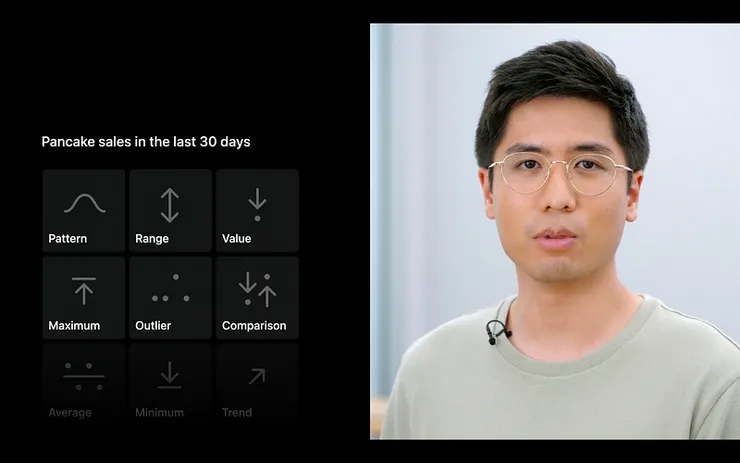
We can easily identify and focus on complicated dataset by designing chart with intention. Before designing the charts, it is important to know there’s various ways to address the information. For example:
- Pattern
- Range
- Value
- Maximum
- Outlier
- Comparison
- Average
- Minimum
- Trend
Three: 5 Topics of chart design
So how to design the chart? Here are five points on chart design:
- Marks
- Axes
- Descriptions
- Interaction
- Color
Marks
The first thing is to decide which marks we will apply, namely, how we idemonstrate the dataset.
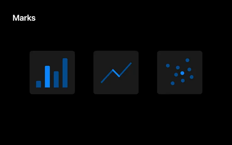
Marks is the graphics for indicating the charts, for example, bars in the bar chart, straight lines in the line chart, and the dots in the scatter chart.
For bar chart, we see it horizontally placed, indicating the changes on dataset.
We can also show proportions by adding it gradually, see how it is accumulated.
Or having bars parallel placed , comparing different values.
There’s lots of ways for people to indicate dataset by using marks.
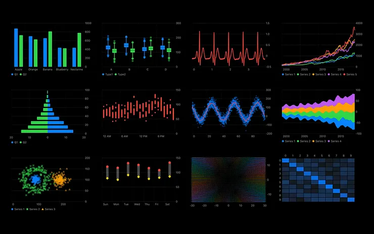
So how do we choose the proper way to indicate the dataset?
Design for goals and data
When it comes to marks, we have to design based on the intention and data. Let’s take the pancakes sales as example, how do we indicate the pancake daily sales?
We can indicate the daily sales by using dots, when the sales is at average. We see a smooth line, looks great, right?
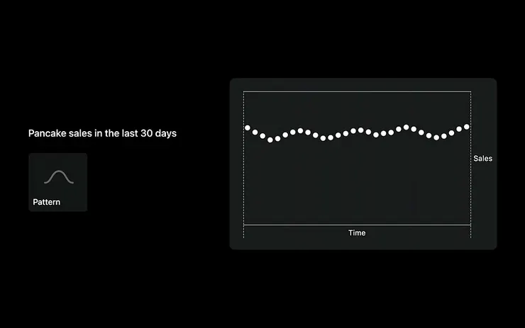
However, sometimes the daily sales would not be close as you might think. If we use dots to indicate the sales, we can hardly identify the daily sales and the changes as well as modes in dataset.
What we want to say is using the real dataset to test your design!
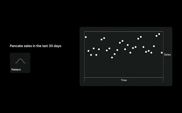
What if we use line chart to showcase the data? In this way we can see the trajectory of the pancakes sales. We can clearly see the changes of dataset using line charts and identify the dataset easily.
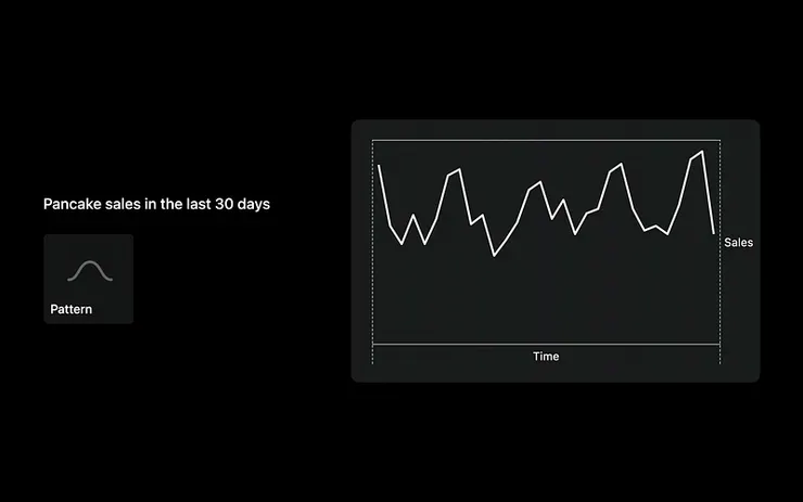
If there’s five days off in the month, there’s no sales. This makes lines wave up and down. We see little change on the line chart.
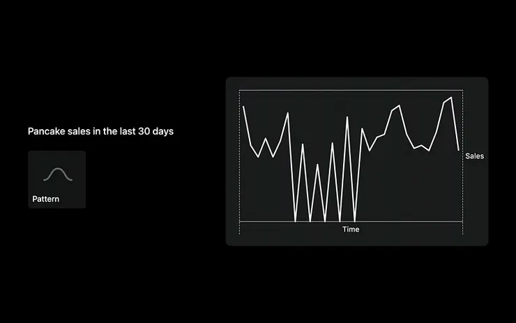
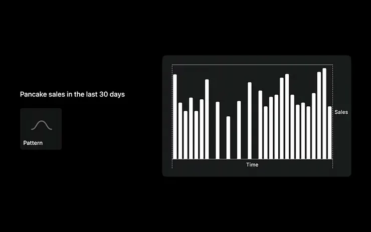
If the dataset is interval, using bar chart might be more appropriate. The bars grow when there’s more sales. Meanwhile, when there’s no sales, it stays 0 on the chart, which makes it more informative and readable.
Make accessible in VoiceOver
For the disables(for example, the blind people), we can make voiceover accessible, there’s an important rule to follow: all the visualized data should be addressed in non-visual format. For example:
- When reading the information, we have to read the related information in data. For example, the sales in a specific year or month. Not only can we read the sales values, but the information on date.
- Consolidate the music scales to address the value. For example, the values is high when the pitch is increased, and low value for descending scale.
In iOS system , set Navigate data values and Audio Graphs to achieve accessibility.
Axes
Now we can see the how the waves move, but how do we know the ranges and its specific value in chart? We can add axes to indicate the ranges. It is also a reference in chart.
Consider the range
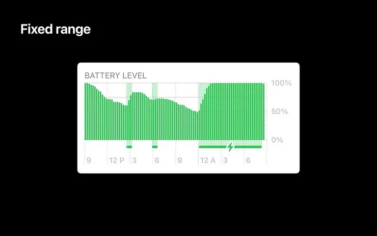
Ranges could be fixed, and could be dynamic. If we know the peak of the value, the ranges is then fixed. For example, the battery power is set in a normal range 0–100%.
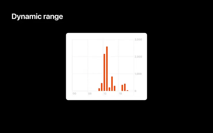
As for steps, there’s no limitation on peak. Dynamic adjusting axes ranges is therefore important. We can still see the differences when we have only few steps.
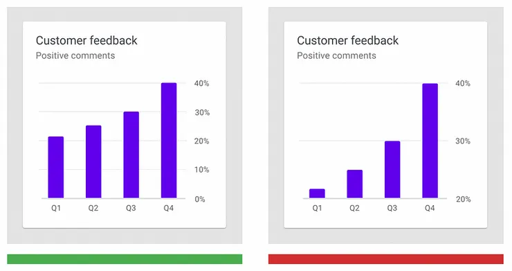
Note:base line for bar charts should start from 0 for formatting the charts.
The chart on the right starts from 20%, the differences on the data looks apparent but hard to identify.
Tailor the density of grid lines and labels
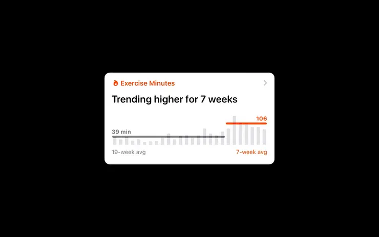
When there’s limitation, we need some references to evaluate the values, we need to tailor the density of grid lines and labels. The more the grids is placed, the easier to evaluate the value.
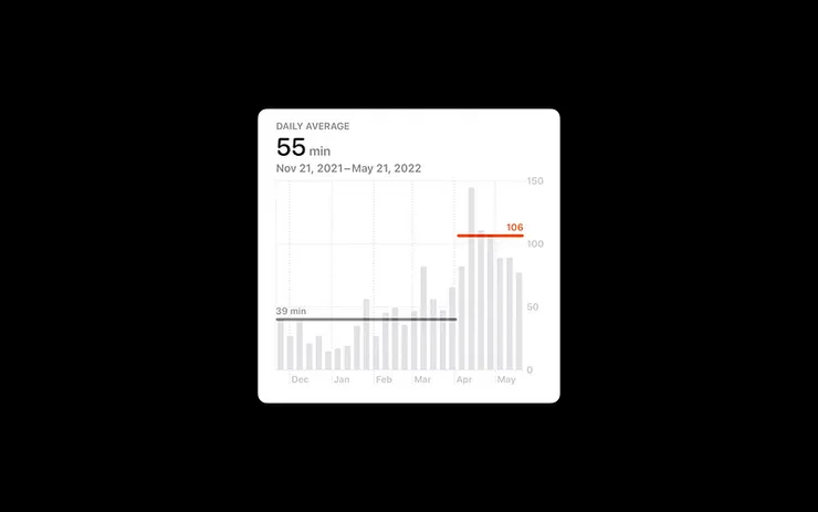
Sometimes we don’t need grids and labels to design the charts, what we need to do is to label average grid in a specific range. For example, the trend on health app, show only the dataset and the sufficient format for tailoring the proper density of grid lines and labels. People cannot focus on the points if there’s many grids and labels.
The preciser dataset we use, the more grids we need. This makes users better identify the values in charts.
Descriptions
It is important to have a precise description and a visualized chart to address the meaning of information rapidly and instinctually.
By having the description, it is important to convey the meaning on labels and axes, making the information more readable.
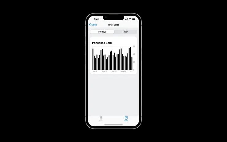
Provide context
Before introducing the charts, we can use description and context for addressing the information, making it easy to identify.
For example, the information from the verticals could be indicated from the axes labels. But the axes is way too small and lean on a side, it cannot address its meaning.
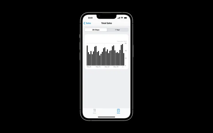
In the case we can use appealing titles to represent the meaning.
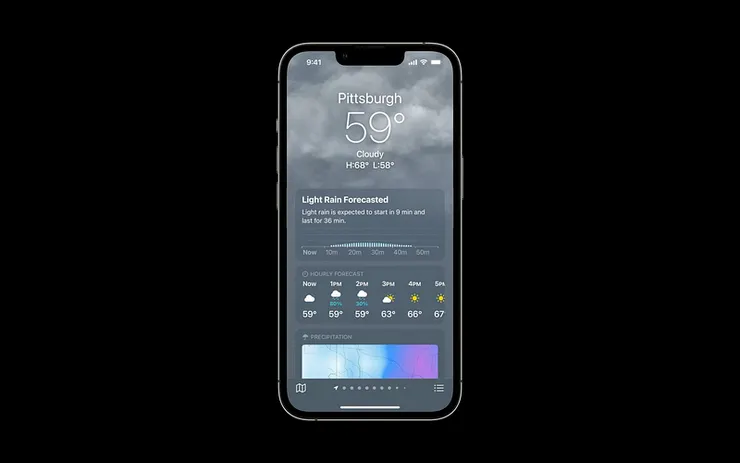
Summarize the main take-away
It would do a great help if we can consolidate a complete and identifiable description. Words like „9 minutes later drops, it will lasts 36 minutes.“
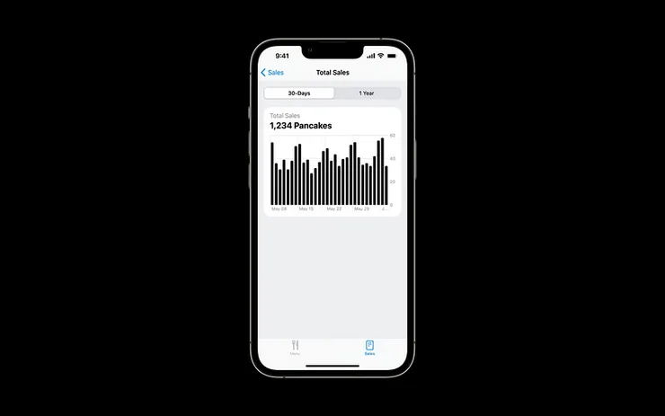
We can find lots of ways conveying the messages in charts, like mentioned previously in the description „pancake sold“ in pancakes sales chart. It could be modified as „today we sold 1,234 pancakes“ as description.
Use Audio Graph
We can use Audio Graph for describing what the axes is by non-visual method with voice over. The description is very important for communicating visual information.
Interaction
For having more interaction, users can identify the precise meaning in dataset showcased. We can design the interval label, having users to click on the designed labels, and see the instant changes of the dataset. For example,
- We can see the apparent part of the chart when we hit the click.

- We can see the changes in year, month and day when we hit the buttons.

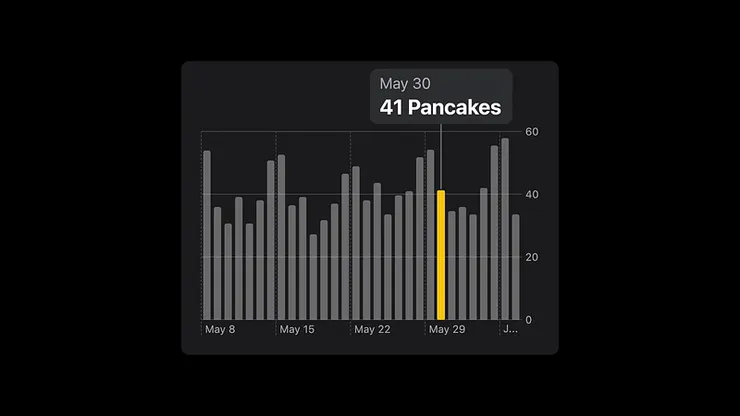
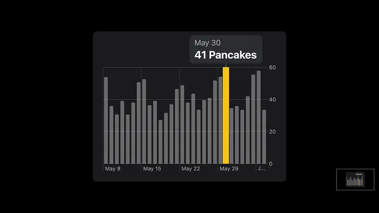
Use large touch targets
When designing, we have to note the touch targets. If the touch target is too small, it won’t have good interaction. Ideal touch targets is as indicated as below, touch targets and the bar targets are different, we enlarge it for better interaction.
Design multiple types or input
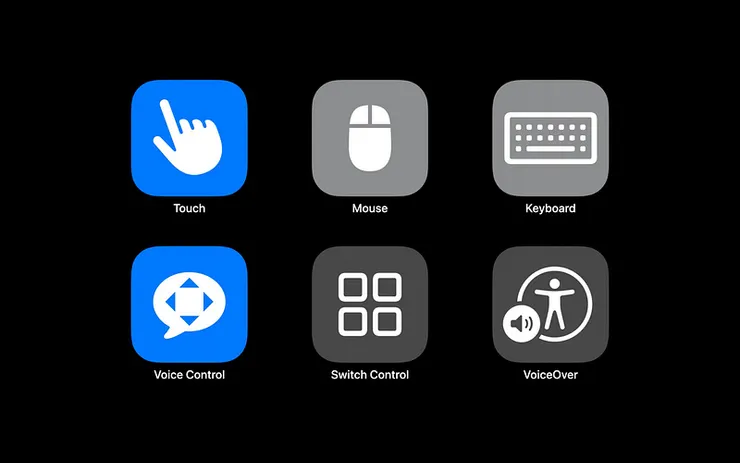
Touch is one of the interactions. The design should subject to multiple devices, be approachable and allow different types, that is to say, all the interaction and experiences should be aligned on all the devices. Multiple types or input includes
- Touch
- Mouse
- Keyboard
- Voice Control
- Switch Control
- Voice Over
Design accessibility labels
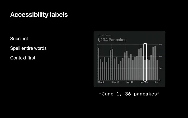
For better voice over, we might need the accessibility labels on indicating the values for voice over. In order to make information more identifiable, we can:
- Succinct (clear, only show necessary information)
- Spell entire words(spell the words but the abbreviation)
- Context first(place the related content in the front)
Color
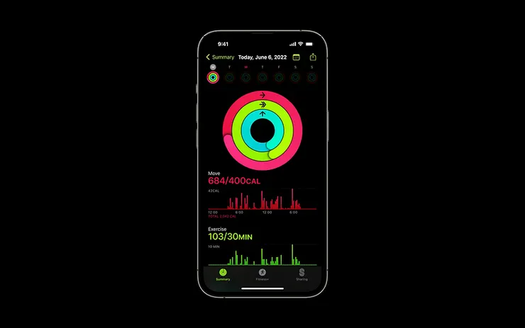
Color could be used for highlighting the features and iclarity on charts. Color makes the charts apparent in App. You can applied colors in:
- The same interface, classify dataset categories (in sports App, red stands for calories you consume, green for the time you exercise while blue is the move)
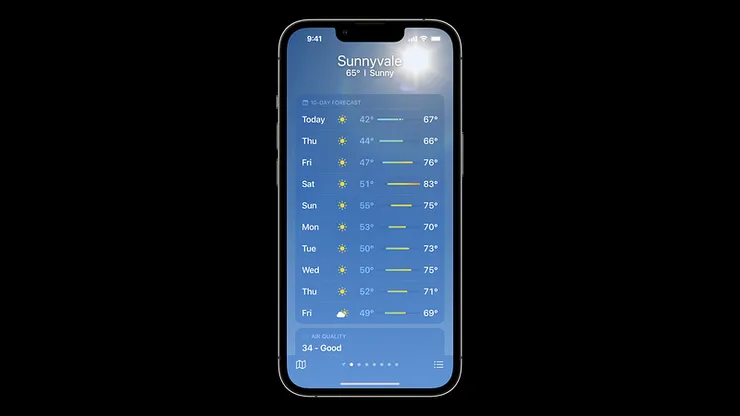
- Conveying the data indicator (orange and blue represent the high and low temperature.)
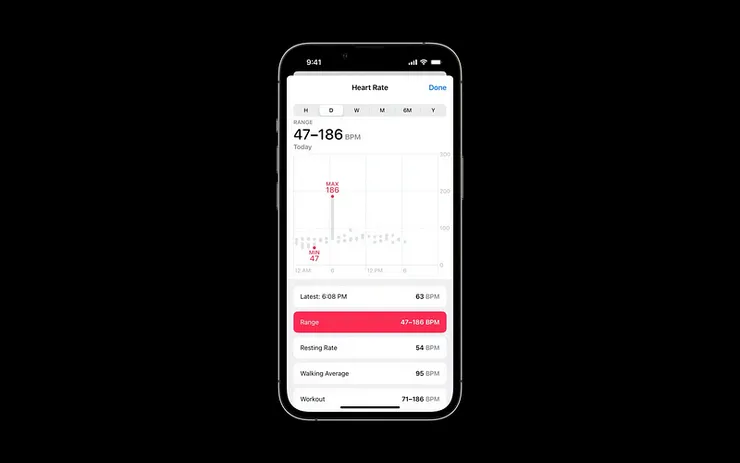
- Removing most of the colors of the dataset, keeping the specific color to showcase its features. ( Heart rate chart shows the highest and lowest heart rate by using the red dots.)
Use color to enhance
Use color for the enhancement. It is better to use colors to identify the charts, not the only way for addressing the messages.
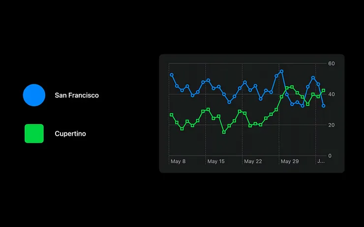
We use shapes to showcase different places, and use colors to highlight the differences. This is identifiable for the people who have color blindness.
Consider associated meanings
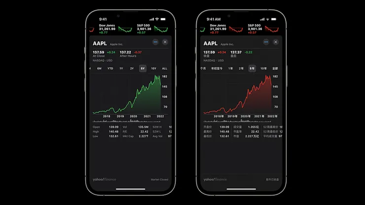
By choosing the colors, we have to consider associated meaning. For example, green is the color to showcase the recharged battery and the red is for low battery. Culture could have impact on the the associated meaning as well, in financial trends red and green have the opposite meaning when apply in western and eastern countries.
Western countries : green is the yield, red for loss; while you see reversed meaning in the East.
Balance visual weight
We have to balance visual weight while choosing different colors. If the color is up beyond another color, it might have hierarchy. In the chart we see Cupertino having bright pink color, this makes it much more important.
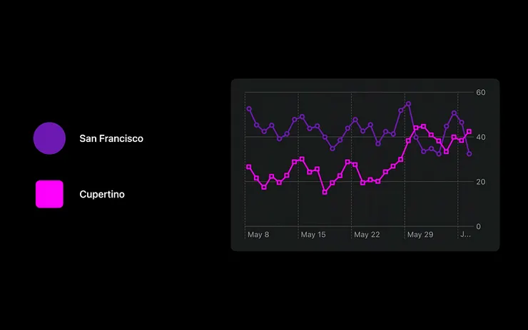
Sometimes when we want to appeal a specific values and ranges, it might be very useful by using the distinct colors. Grey represents the activities you’ve done while the red means the current activities in health App.
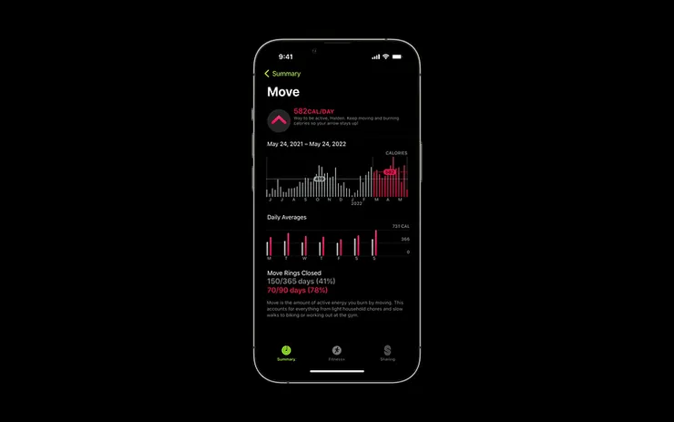
Choose distinct colors
Choosing the distinct colors and contrast the color enhance the accessibility and readability. Ensuring the colors has proper contrasting among charts will help color blindness people in identifying the charts and enhancing the design for people.
You can use color blindness filter to inspect the colors.
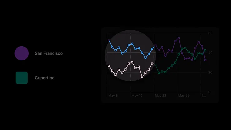
Use color blindness filter to inspect the colors.
Respect system settings
In the last, by designing the color to ensure the charts fits into the system setting. We can adapt the dark and light mode for highlighting the contrast.
Conclusion
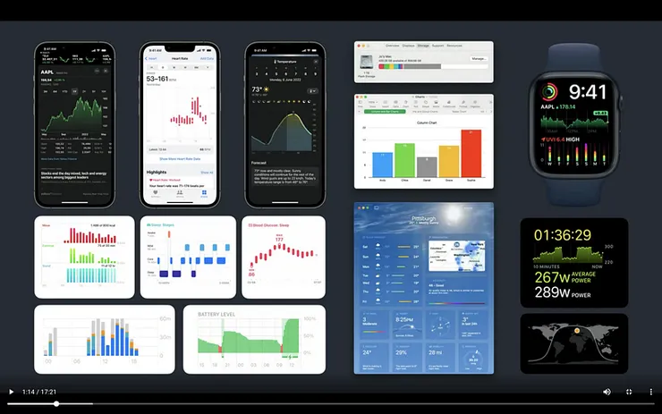
An effective chart turns complicated dataset into visual graphs, helping users focusing on the important Information, and makes dataset more identifiable and usable. Hence, designing a good chart for the readability is an important thing. Let us review the points:
- Design app experiences with charts
- When to use chart
- How to use charts
- Chart design systems
2. Three principles for designing the charts
- Focused
- Approachable
- Accessible
3. Five points for designing charts
- Marks
- Axes
- Descriptions
- Interaction
- Color
Charts addresses lots of information, only the most important information is made into charts as it might be the first thing we notice on the interfaces. Principles and points mentioned above in the article could be applied for designing charts for appealing and effective charts.
Resources
The article is written based on WWDC 2022 chart design and Material Design.
References:
Note: The Chinese version of this article was written by Cheryl Fang(Able intern), edited by Steven Yeh, and interpreted, translated by Ching Hsu.


