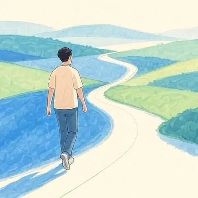
Introduction
The world is filled with colors, each evoking emotions, memories, and even physical reactions. Among these, Color Rush—the overwhelming sensation brought by bold, saturated hues—has become a fascinating subject in design, marketing, and psychology. This article explores the power of Color Rush, its effects on human perception, and how it influences industries from fashion to digital media.

What Is Color Rush?
Color Rush refers to the intense visual and emotional response triggered by highly saturated, bright, and contrasting colors. Unlike muted tones, these vivid shades demand attention, creating a sense of excitement, urgency, or even chaos. The phenomenon is widely used in advertising, art, and branding to capture interest and provoke strong reactions.
The Science Behind Color Rush
Studies in color psychology reveal that vibrant colors stimulate the brain more intensely than softer tones. For example:
- Red increases heart rate and conveys passion or danger.
- Yellow grabs attention and evokes optimism.
- Blue promotes calmness but in neon forms can feel electrifying.
When these colors are amplified—such as in a Color Rush palette—the brain processes them faster, making them ideal for call-to-action buttons, fashion statements, and media campaigns.
Color Rush in Fashion and Design
The fashion industry thrives on bold statements, and Color Rush trends dominate runways and streetwear alike. Designers like Jeremy Scott (Moschino) and brands like Off-White use high-intensity hues to create unforgettable looks.
Key Trends in Color Rush Fashion
- Neon Revival – Bright pinks, greens, and oranges dominate urban fashion.
- Clashing Contrasts – Pairing opposing colors (e.g., purple and yellow) for dramatic effect.
- Digital-Inspired Palettes – Electric blues and cyans influenced by virtual aesthetics.
These trends show how Color Rush isn’t just about visibility—it’s about making a cultural impact.
Color Rush in Marketing and Branding
Brands leverage Color Rush to stand out in crowded markets. Fast-food chains (McDonald’s, Burger King) use red and yellow to stimulate appetite and urgency. Tech companies like Instagram and TikTok employ gradients of vibrant purples, pinks, and blues to appear dynamic and youthful.
Why Does Color Rush Work in Advertising?
- Instant Recognition – Bright logos are easier to remember.
- Emotional Triggers – Colors like orange (energy) or magenta (creativity) shape brand personality.
- Higher Engagement – Social media posts with bold colors get 30% more interactions.
The Downside of Color Rush: Overstimulation
While Color Rush is powerful, excessive use can lead to visual fatigue. Overly saturated designs may feel aggressive or chaotic, causing discomfort. Designers must balance vibrancy with negative space to maintain harmony.
Conclusion: The Future of Color Rush
As digital media evolves, so does the demand for eye-catching visuals. Color Rush will continue influencing trends in fashion, branding, and even virtual reality. By understanding its psychological impact, creators can harness its power effectively—whether to excite, inspire, or persuade.
From runway shows to smartphone screens, Color Rush proves that color isn’t just seen—it’s felt. And in a world craving stimulation, its bold presence is here to stay.