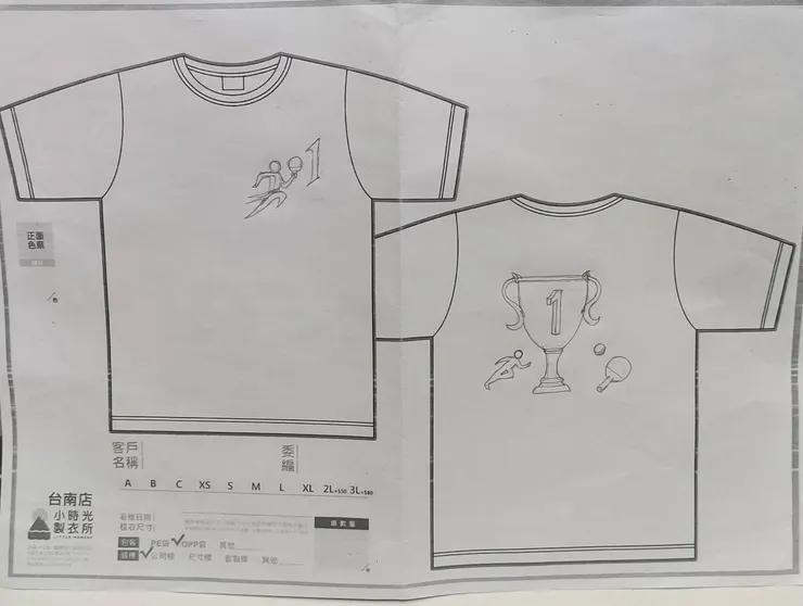
今天陪小兒子畫班服的logo,因為他即將升上國二,他的班級是國二1(201)班,所以班服logo的設計理念是要將 數字 "2" 和 " 1 " , 桌球拍 , 跑步人形, 融合設計成一個logo,因為他的班級是體育資優班,有分成桌球隊和田徑隊.
他先構思出想放進logo的元素,然後用google搜尋相關參考圖片,也利用AI輔助設計來激發創作的靈感,後來正面的logo主要是以奔跑衝刺的人形代表"2",手持桌球拍代表"0",數字1直接代表"1".
而背面的logo主體是中間一個金色大獎盃(中間寫上1) 左邊有一綠色奔跑衝刺的人形代表田徑隊,右邊則畫上桌球拍和桌球代表桌球隊.
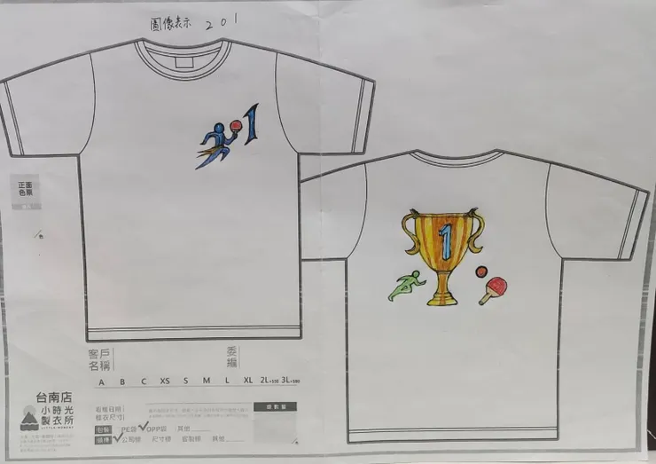
最後開始上色,先塗上色再瞄黑邊,原本要將獎盃塗色成金光閃閃的樣子,結果變成西瓜斑紋,失敗!
enter the second year of junior high school. His class is 2-1 (201), so the design concept the
class uniform logo is to integrate the numbers "2" and "1," a table tennis racket, a running figure
into one logo. Since his class is a sports gifted class, divided into table tennis team and track team.
He first conceptualized the elements he wanted to include in the logo, then searched for relevant
reference images on Google and used Al to assist in designing to inspire creativity. The front of the
logo mainly features a running figure representing "2," holding a table tennis racket representing
"O," and the number 1 directly representing " The main part of the logo on the back is golden
trophy in the middle (with a "1" written on it). On the left, there is a green running figure
representing the track team, and on the right, a table tennis racket and ball representing the table
tennis team. Finally, he started coloring, appiving the colors first and then outlining in black.
Originally, he intended to color the trophy to look shiny and golden, but it ended up looking like
watermelon patterns, a failure!
有空也可以到部落格看看 https://tslv.pixnet.net/blog 感謝您!!