你可能將會與一個海外的客戶開會,現在正在努力的準備一份會讓人留下深刻印象的報告,我也深深相信,對於內容還有表達的方式,你已經深思熟慮了。只是,你認為最好的表達方式,有符合對方的偏好嗎?例如他們會喜歡圖片多或文字多?還需要考量哪些部分幫助你的演講報告更上一層樓?
前段日子我恰好跟一位駐東京的日本經理談論這個困擾。他的團隊與英國的一所大學有合作,所以需要進行ㄧ個網路會議並且呈現他們的報告。這份講稿他已經準備了很久,可是依然有一點緊張,因為他沒有國際演講的經驗,所以想要多了解有關歐洲人在演講上的觀點和偏好來做準備。這問題乍聽之下我很想拍拍他的肩膀跟他說,「不用擔心啦,順其自然」。不過,當我仔細思考的時候,才發現其實兩邊的文化差異很大。
文化差異會造成什麼樣的問題呢?正好因為日本跟西方國家有很多思想差異,讓我用他們的文化偏好來做一個討論的標準,來敘述一些因為不同的文化觀點而帶來的問題。我先聲明,我並不是平面設計師,也不是商業演講大師,這些觀點是透過我多年在歐洲工作經驗來累積的,是一般人不會跟你講的。我希望這些觀點可以幫大家用不同的方向思考,讓你的報告能建立良好的第一印象,增加成功率。
到底有什麼文化的不同?
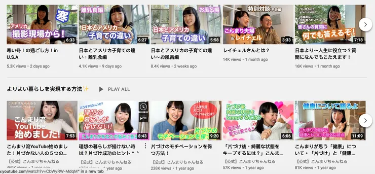
開始之前我想要先介紹一個人,近藤麻理惠,或稱為KonMari。她是一個日本的專業「整理師」,專門教大家如何收納還有整理居家物品。她在日本跟在海外其實都非常紅,在Netflix上面也有自己專門的節目。不過最有意思的是她Youtube頻道的經營策略。它有兩個版本,一個是針對日本市場,另一個是針對海外西方市場。海外市場的Youtube版面設計非常乾淨,使用白色而且極簡主義的路線。相比下,日本版則是色彩繽紛還有很多的字目。連她縮圖照片的妝容都完全不一樣。不用多說,你猜對了,她正在應用不同的偏好來吸引她的目標受眾。


(1)西方偏好 :口語的演講
西方演示者往往非常依靠口語的演講和解釋,所以演示頁面呈現的訊息會比較少。尤其在會議裡,一般開會者的心態是以討論為主,所以不需要看到所有的資料,只需要把這些主題以話題給帶出來就好。
常見的演示頁面(PowerPoint) 偏好:
- 極簡; 很多空白
- 句子很短; 常常只有一行字
- 只有一個主標題,有時甚至沒有標題
- 整張演示頁面只有一張圖片或一個關鍵字
- 利用下劃線,斜體或粗體來突出顯示關鍵詞
- 決策符號是:打勾 (= Yes),問號(= Maybe),打叉(= No)
(2)日式偏好 : 閱讀的演講
日本人的理論是確保任何人可以靠閱讀理解內容,而不是靠別人來轉達他們想要說的內容。其實這是一個很實用的方法,如果英文口語能力不好時,可以靠閱讀內容來做溝通補助。另外,會議結束後,當他們將演講發送給對方時,不需要修改任何東西。
常見的演示頁面(PowerPoint) 偏好:
- 大量信息,文本,圖形擠在同一頁
- 經常一起使用三種標題 ; 主標題,副標題,還有迷你內容來快速解釋文章內容
- 利用另一種顏色(通常是紅色或藍色)來顯示關鍵詞 ; 文本通常為黑色為主顏色
- 使用大量卡通人物來描述某些情況或者流程
- 決策符號是:圓圈(= Yes),三角形(= Maybe),打叉(= No)
文化差距考量點
根據上述內容和我多年參加日本人和歐洲人開會的經驗,我整理了一些最常聽見的回應。
1.信息超載
許多參加過日本演講的歐洲人常告訴我,除了不習慣以外,他們常常被大量的視覺和數據信息所淹沒,感到眼花繚亂。他們需要花費大量時間來處理信息,了解重點,尤其是在他們不熟悉內容的情況下。其實這情況有點矛盾,當訊息很多的時候,演講的功夫就很重要,演講的人需要幫助表達這個文章的重點,來幫助聽者消化訊息。可是如果演講人的英語能力不是那麼好,字跟圖多一點是可以有幫助的,如何拿捏的恰到好是看個人的能力了。
2.迷失在翻譯中
語言差異不但會影響句子的長度,也會改變演講的感覺。在日語中,“漢字”的使用會讓句子更變得更短,可是如果試圖用英語來表達同樣的事情時,往往需要重新調整文句的長度還有位置。中文也是如此,中文只需幾個字就可表達很多內容, 然而一旦翻譯成英文,時常導致頁數變多並改變圖形頁面。有幾回,我的日本同事為了想將英文翻譯融入原本的日文版面,開始縮短英文句子。問題是,這不但改變句子的原始含義,我的歐洲同事(包括我自己)也必須猜測這文章到底在講什麼,造成更多的問題還有更多的時間去了解內容 ,也違背了「溝通」的目的。
3.符號引用
在歐洲使用圓形和三角形的符號並不是用來做Yes or Maybe的決策。如果使用不同的符號,理論上我們可以通過上下文來理解它的定義。不過當使用人們不習慣的符號時,他們無法快速獲取信息或者了解你想講什麼,好的狀況下他們會確認你的思想,不過有些人可能問都不問,你根本不知道你的訊息是否傳達成功了。我有一位歐洲同事會固定把這些符號改成西方的偏好,他的解釋是,當你利用一些沒有文化意識的符號,客戶會覺得這個公司不了解歐洲思維,也沒有誠意。
4.漫畫太不專業了
日本人非常喜愛利用圖形和漫畫來說明他們的觀點。儘管我個人認為它在溝通和解釋某些程序時非常清晰有用,許多歐洲人會開玩笑地說日本的卡通讓演講文稿看起來“幼稚”,我還有歐洲同事覺得這種風格不專業,當他們運用日本原稿的時候,會選擇把漫畫給去掉,而利用口頭解釋。
考慮點
以上只是一些示例,幫助你思考如何進一步改進你的演講報告。既然已經投入了大量時間書寫內容,希望也考量到文化層面再加強,幫助你畫龍點睛,增加成功的要素。觀點沒有對錯之分,畢竟每個人擅長的能力都不同。例如,如果你對英文演講沒有信心,或者英語口語表達不夠清晰,那麼你可能更想依靠在視覺上呈現更詳細的書寫介紹,只有你本人知道需要權衡口語與視覺多少比例。
English Version
Preparing PowerPoints for your overseas meetings? Do you know how to make it better? Things they are not telling you from the other side.
Let’s say you have a meeting with an overseas client and you are putting a lot of effort into creating a presentation that aims at making an impression. I am sure that you have already thought long and hard about the content to include, what you want to say and how you want to express it but have you ever thought about the presentation preferences of your audiences? Do they prefer more pictures or more words? Which presentation elements should you consider to improve and increase the positive outcome of your meeting?
A while back, I was speaking to a Japanese manager based in Tokyo and he had this exact dilemma. His team had a business collaboration with a university in the UK where he was required to make a virtual presentation. He was feeling a bit nervous about the presentation style and asked me for some pointers from an ‘European’ perspective. When I reflected on the question, I realised that there were definitely some difference and preferences that stood out between the two cultures and definitely could be used as an example to reflect upon.
I am neither a graphic designer nor a business public speaking guru, instead I hope to offer a cultural perspective based on my personal experiences that might be helpful when you are considering about how to best make an in impression with your presentation and boost your chances of success. Below I share an analysis of the Japanese presentation preferences versus ‘the west’ as an example to highlight specific cultural differences and how they could create potential problems. These are insights and feedbacks that you don’t normally hear openly.
Let’s talk about the Differences
First of all, I would like to introduce you to Marie Kondo or KonMari. She is a Japanese organising consultant. She teaches people how to better utilise their limited spaces. Maybe you have heard of her. She is well known in both Japan and in many overseas markets and has her own Netflix show. She also has a Youtube channel in Japan and overseas. However, what is most interesting about her is her strategy on Youtube. She has two versions: one targeted to overseas markets and one to Japan. The overseas video is clean, white and minimal, while her Japanese video had many more colours and longer texts. From thumbnails to makeup, everything looks totally different. You get my point, she’s trying to appeal to specific preferences to capture her target audiences.
The same principle applies to PowerPoint presentations. Below I have summarised the observations and insights on different presentation styles that I have gathered over the years attending hundreds of conferences, events and meetings across different countries. A call out, be aware that I am generalising a little here as PowerPoint presentation styles are also hugely affected by company culture, individual personality and industry background (e.g. design background vs technical background).
(1) Verbal : Western Powerpoint Preference
Generally, only minimal information is included in the presentation slides and typically the presenter tends to rely a lot on the speaking and provides verbal explanations. If in a meeting, the presenter might also be expecting feedback or a discussion so it doesn’t need to have all the presentation on the slides.
Noteworthy preferences:
- Clean. Lots of spaces
- Sentences are short or one line long
- Only one main title;
- Sometimes not even a title but just a text or picture covering the entire slide
- Use of Underline, Italic or Bold to highlight/emphasise key words
- Decision making symbols tends to be a : tick (YES), question mark (Maybe), cross (No)
(2) Reading : Japanese Powerpoint Preference
The Japanese’s theory is that you should make sure that someone can understand what they are trying to say by reading and not relaying on someone else explaining it to them. This is very useful even after the meeting when they send their presentation slides to the their audience.
Noteworthy preferences:
- A lot of information, text, graphics squeezed on one slide
- Multipe titles including - a main title, sub-title, mini content
- Colour of the texts tends to follow the traffic light system. Texts are typically in black; often another colour (usually red or blue) is used to highlight keywords
- Use many cartoons like figures to describe certain situations or processes
- Decision making symbols are: Triangle (maybe), Circle (Yes) and Cross (No)
Cultural Gap Considerations
Based on the above and on my experience of attending meetings with Japanese and with the Europeans, I wanted to highlight some of the most common feedback that I have heard over the years.
1.Information Overload
Many Europeans who have sat through a Japanese presentation tend to tell me that they get overwhelmed by the amount of visual elements and data information in their presentation slides. It takes a lot of time for people to process the information especially if they are not familiar with the content. To be honest, it is a bit of a catch-22 situation. If the presenter was confident with their English, they might not needed all the heavy text and could rely on more visual instead. At the end of the day, how to find the right balance still comes down to the capability of the individual.
2. Symbol references
In Europe at least, the use of symbols like the Circle (=Yes) and Triangle (=Maybe) are not typically used for decision making. Although it isn’t hard to decipher the intended message based on context but when using symbols that people can’t understand in that context, they can’t pick up the information as quickly. One of my workmate would also make sure he change the symbols into the western preferences and his reasoning is, when you use ‘foreign symbols’ that doesn’t have the same context, the reader could mistake that either you don’t understand the local culture or you might have no interests to understand their culture. These are detrimental to doing international business.
3. Lost in Translation
Language differences may contribute to the length of a sentence, as well as change the feel of a presentation. In Japanese, the use of ‘Kanji’ makes the sentences shorter, in comparison, the same sentence becomes far longer when expressed in English. This is similar in Chinese. In Chinese, you may be able to express something in just a few words and could squeeze a lot of content into a page. However, the English translation might take us more space causing changes to the visual layout and the amount of words on a page. I remember sometimes my Japanese colleagues wanted to fit the translation into the Japanese layout and started to change the meaning of sentences by shorting them. My European colleagues (including myself) was scratching our head because we either couldn’t understand the context or the sentence just lost it’s original meaning.
4. Cartoons are too Comical
The Japanese likes to use graphic and manga to illustrate their point. I remember hearing a lot of Europeans making jokes about how the Japanese cartoons make a presentation look ‘childish’. A lot of people in the European team don’t find this style professional and I knew some people even chosen to take them out and opt for verbal explanations instead. The European perspective is understandable but in defence of the cartoons, in some contexts, I think that they are very clear and useful in communicating and explaining certain procedures.
Consideration Points
The above are just some example to help you consider about the other elements that will improve your presentation further and drive success. Given the amount of time that you have dedicated to make this opportunity happen, we sometimes forget the cultural elements that could potentially make it better. There is no right or wrong but you need to find the right approach based on your own situation and skillsets. For example, if you don't have confidence in your presentation skills or English-speaking skills, then you may want to rely more on visual elements and on writing more detailed presentations rather than using verbal explanations. Only you know where that trade-off needs to be.


